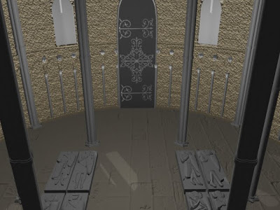
First test run through the lighting and colour textures for the inside of the church. I have tried to create the inside of the in an ambiance occlusion style as the out, however through trial and error there is no occlusion showing up for the interior of the building. The bump maps need reducing as the inside walls need to be smoother than the out, this just isn't working at the moment. The light themselves are also to dark. To recreate the interior of the Maya church to play true to that of the church that stands in London, the space needs to have more light without having interior lights. The Temple church in London was bright with all its light coming from outside. However with all the problems this test piece has, it is on the right lines. for this piece, i need to render out in render layers for the interior and the exterior because as you can see from the image below the light and shadows are not right.


Ohhh nice graves, your walls have a golden sheen to them are they supposed to? but I love the pocked look of them.
ReplyDelete